Direct flyers have their own questionable return on investment.
What would it be for PartyCity? Their primary audience members are teenagers and their adult parents. Both being technically savvy consumers and capriciously averse to direct mail ads.
When your cash cow is teenage girls- flyers in the mail should be one of the lower priorities on your marketing list. If at all. Maybe you shouldn't spend it their at all. But you did. So let's do this now.
Party City- Halloween 2014
Homely looking image. Family friendly and quaint.
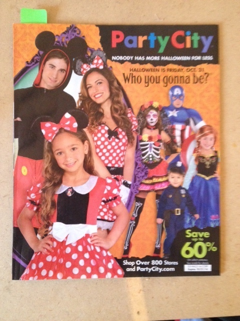
Cover illicits 3 small actions:
(1) Save up to 60%
(2) Shop Over 800 Stores
(3) PartyCity.com
Page 1: No editorial note, or prominent CTA. Commences catalog clearly without explanation. Good enough, pictures speak more anyway.
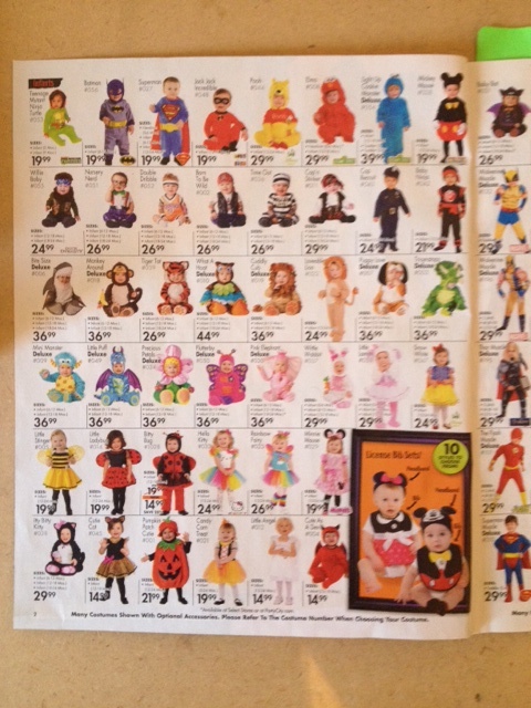
Enter babies. 40 thumbnail images on each page- 38 to be exact on most. The showcase image is the size of 2 thumbnails highlighting best-sellers or inspirational pieces. There are 17 such pages. The layout is consistent, to an extreme.
The last 4 pages are different utilizing a larger canvas; prominent color palletes being Orange&Black. These are for accessories- hats, wigs, make-up & the miscellaneous.
Oh the Miscellaneous filler-page: Dog Costumes, Hanging Insects/Reapers & Ghostly white candy coating for strawberries.
REVIEW POINTS:
Manual word count for the phrases used:
(Because that's how I spend my free time)
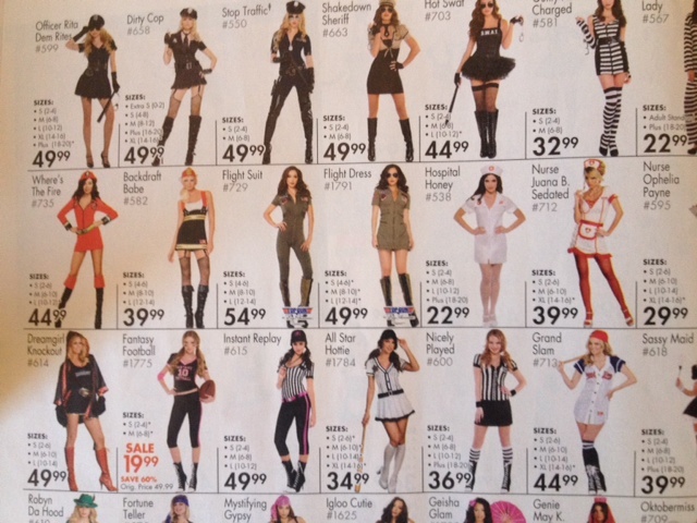
Sexy: 2
Witch: 4
Witch > Sexy
What's really good is the inventory. They have product. The models and the costumes are definitely doing a good job. So business should be jolly.
What's a flyer matter anyway?